More Projects


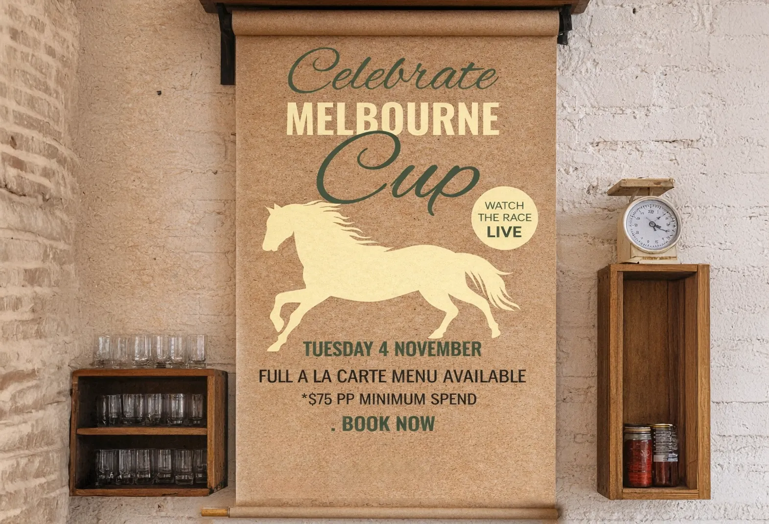
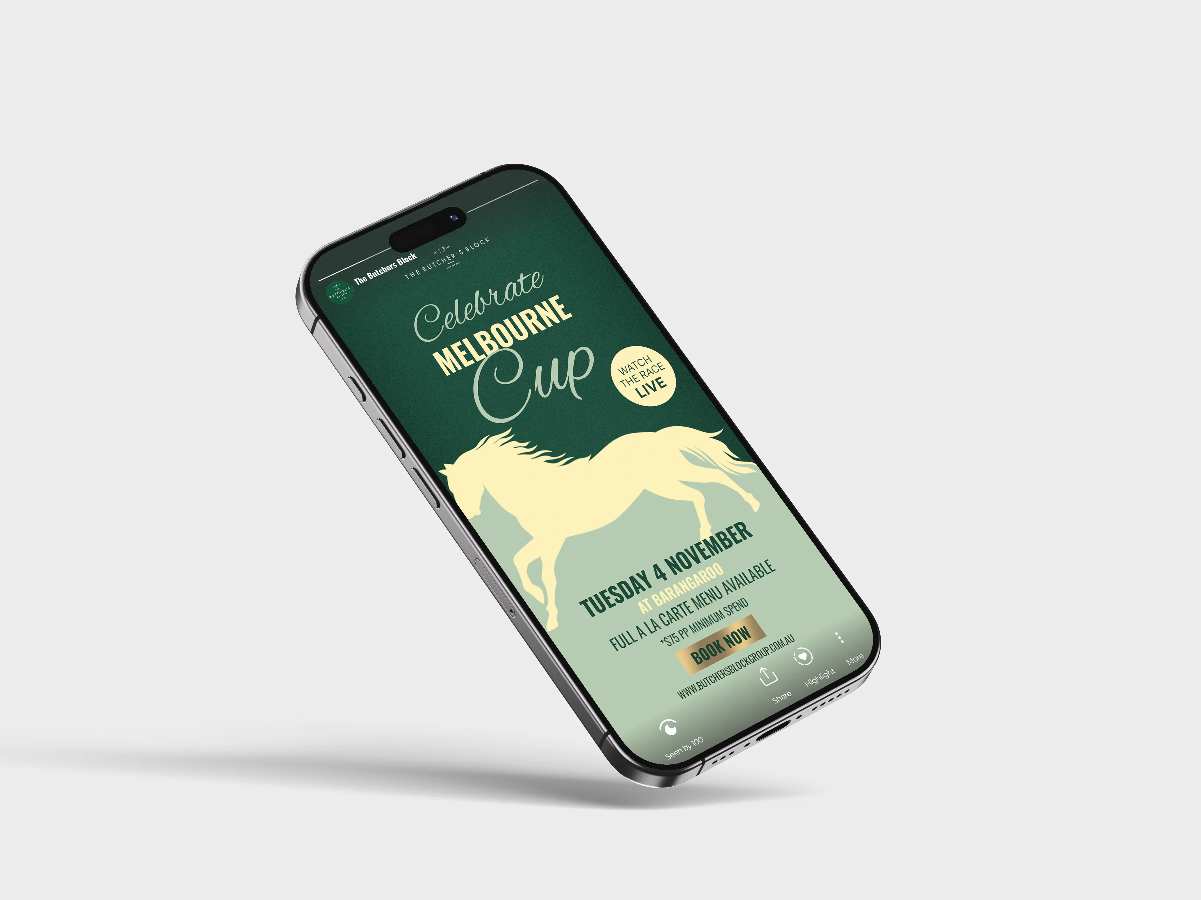
Melbourne cup campaign
Melbourne Cup Hospitality Activation

About the Project
One & Oily is a natural beauty product created by Haz Beauty, designed to support skin and hair health using a single, natural ingredient.
While the product itself was well received, feedback from customers and stockists highlighted that the existing packaging lacked presence and didn’t stand out effectively on shelves. The goal of the project was to redesign the label to better reflect the product’s simplicity and quality, while improving visibility in a retail environment.
My Role
I worked on the packaging redesign and visual refresh for the One & Oily product.
This involved rethinking the label design to improve clarity, hierarchy and shelf impact, while staying true to the brand’s natural and minimal ethos.
My Approach
The redesign focused on stripping the packaging back to its essentials.
I refined the layout, typography and visual balance to create a cleaner, more confident label that clearly communicated the product’s key qualities. Particular attention was given to legibility and contrast, ensuring the product would stand out when displayed alongside competing brands.
The aim was to create packaging that felt simple, intentional and premium — without overcomplicating the design.
What Was Created
Redesigned product label
Updated typography and layout system
Improved hierarchy and readability
Packaging design optimised for retail display
Result
The updated packaging gave One & Oily a stronger shelf presence and a clearer visual identity.
The redesigned label helped the product stand out more effectively in retail settings, while better communicating the brand’s values of simplicity, quality and natural ingredients.